Arabic Font CSS: A Tested Setup from @font-face to Bidi
A working Arabic font CSS setup takes one @font-face rule per weight and a three-line rule for the document, but several of those lines hide a trap that only Arabic triggers: a subset that quietly drops a font’s alternates, a Latin file downloaded by a page with no Latin on it, vowel marks squeezed by a tight line box. Every browser test below was run in Chrome 155 and Firefox 158 on Windows 11 on October 23, 2026, and every file size was measured, not estimated.
The minimal Arabic font CSS setup
Start in the HTML. dir="rtl" sets the base direction of the page; lang="ar" tells the browser which language it is shaping, and fonts react to it. Noto Naskh Arabic, for example, draws the digits ۴ ۶ ۷ differently under lang="fa" and lang="ur": we checked both in Chrome, and the font’s localized forms switch with the attribute alone.
<html lang="ar" dir="rtl">On an English page that quotes Arabic, mark each Arabic passage instead: <p lang="ar" dir="rtl">, or <span lang="ar"> inside a sentence.
Then one @font-face rule per weight you actually ship. Here with Tajawal, whose Regular and Bold Arabic subsets weigh about 9 kB each:
@font-face {
  font-family: "Tajawal";
  src: url("/fonts/tajawal-arabic-400.woff2") format("woff2");
  font-weight: 400;
  font-style: normal;
  font-display: swap;
  unicode-range: U+0600-06FF, U+0750-077F, U+0870-08FF,
                 U+FB50-FDFF, U+FE70-FEFF, U+200C-200D;
}
@font-face {
  font-family: "Tajawal";
  src: url("/fonts/tajawal-arabic-700.woff2") format("woff2");
  font-weight: 700;
  font-style: normal;
  font-display: swap;
  unicode-range: U+0600-06FF, U+0750-077F, U+0870-08FF,
                 U+FB50-FDFF, U+FE70-FEFF, U+200C-200D;
}

html:lang(ar) {
  font-family: "Tajawal", system-ui, sans-serif;
  line-height: 1.7;
  font-synthesis-style: none;
}
WOFF2 alone is enough for current browsers; TTF and WOFF fallbacks only add weight. Declare only the weights you have: when we loaded Noto Naskh Arabic in 400 only, Chrome drew <b> text with a synthetic bold, smeared and heavier than any real cut.
Bilingual font stacks: who draws the Latin?
Arabic pages are rarely Arabic only: brand names, code, prices and URLs bring Latin in. You have three ways to handle it.
- One family that covers both scripts. IBM Plex Sans Arabic, Tajawal, Readex Pro, Cairo and Almarai all ship a Latin alphabet designed to sit beside the Arabic. One
font-family, matched weights, no seams. You will find more of them among our Arabic sans serif fonts; each font page says whether Latin is included. - Latin family first, Arabic family second.
font-family: "Brand Sans", "Noto Naskh Arabic", serif;works because the browser picks a font character by character: anything the Latin font lacks falls through to the next family. Check that your Latin font has no Arabic glyphs at all, or the few it has (often the Arabic comma ، or question mark ؟) will come from it. - Two files, one name. Declare two
@font-facerules with the samefont-familyand differentunicode-rangevalues, one pointing to your Latin file and one to your Arabic file. CSS then sees a single family, which keeps every selector simple.
The second pattern has a limit: fallback works letter by letter, not word by word. If your Arabic file lacks one letter, that letter alone comes from another font, with another design and weight, in the middle of the word. We saw it in the text= test further down. Test your subsets with real sentences, not with the alphabet. When whole words fall apart instead, see our fixes for Arabic letters that refuse to connect.
Then the selector. :lang(ar) matches the element that carries lang="ar" and every element inside it, because language is inherited. We set Tajawal on :lang(ar) and Noto Naskh Arabic on a .naskh paragraph: the paragraph rendered in Naskh, but its <em> and a <span> of digits switched back to Tajawal, because :lang(ar) matched them directly and beat the inherited value. Writing the rule as html:lang(ar) fixed it. For Arabic islands in an English page, [lang|="ar"] behaves like html:lang(ar): it only matches elements that carry the attribute, and the |= form also catches regional tags such as ar-MA or ar-EG.
unicode-range for Arabic: the exact code points
unicode-range tells the browser which characters a file can draw. It downloads the file only if the page uses at least one of them. The Arabic blocks, from the Unicode Character Database (Blocks.txt, version 18.0):
| Range | Unicode block | What it holds |
|---|---|---|
U+0600-06FF |
Arabic | Letters, harakat, Arabic-Indic digits, ، ؛ ؟ |
U+0750-077F |
Arabic Supplement | Extra letters for African and other languages |
U+0870-089F |
Arabic Extended-B | Additional letters and marks |
U+08A0-08FF |
Arabic Extended-A | Letters and Quranic marks |
U+FB50-FDFF |
Arabic Presentation Forms-A | Ligatures such as ﷺ and ﷲ |
U+FE70-FEFF |
Arabic Presentation Forms-B | Legacy contextual forms (pasted text) |
U+200C-200D |
General Punctuation | Zero-width non-joiner and joiner |
The two Presentation Forms blocks hold frozen copies of the contextual forms of Arabic letters. Normal text never uses them, since the font picks each form at display time, but old pasted text can, so keep them in the range.
Arabic Extended-C (U+10EC0-10EFF) and the Arabic Mathematical Alphabetic Symbols (U+1EE00-1EEFF) exist too; few text fonts cover them. Google Fonts goes further and serves a finer list for its Arabic subsets. For Tajawal on October 23, 2026, it began U+0600-06FF, U+0750-077F, U+0870-0891, U+0897-08E1, U+08E3-08FF, U+200C-200E, U+2010-2011, U+204F, U+2E41, U+FB50-FDFF, U+FE70-FE74, U+FE76-FEFC, then listed Rumi numerals, Extended-C and the math symbols. It skips a few format characters and unassigned code points, and adds the left-to-right mark, two hyphens and two reversed punctuation marks.
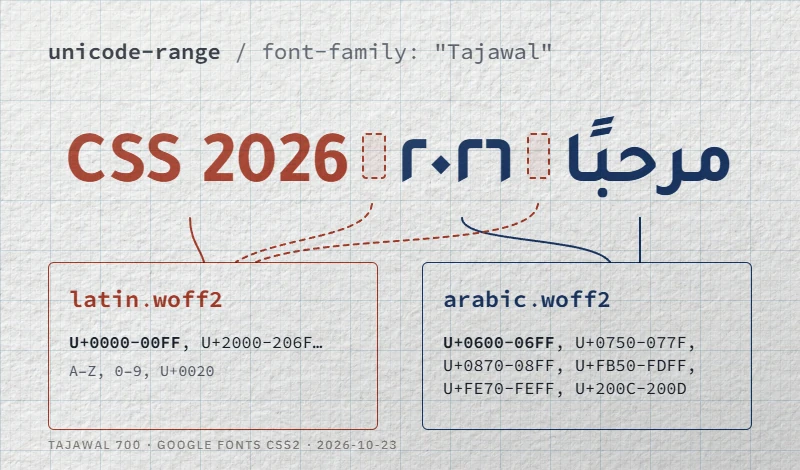
We split Tajawal into an Arabic file and a Latin file with these ranges, then watched the network panel. A page in English loaded the Latin file only. A page in Arabic, with no Latin letter on it, loaded both: the space, U+0020, belongs to the Latin range. Plan your font budget for Arabic pages accordingly: the Latin file comes with them.
Subsetting an Arabic font with pyftsubset
A desktop TTF carries every glyph its designer drew. A subset keeps the characters you need and turns the result into WOFF2. The tool is pyftsubset, part of fontTools; WOFF2 output also needs the Brotli package.
pip install fonttools brotli

pyftsubset Tajawal-Regular.ttf \
  --unicodes="U+0600-06FF,U+0750-077F,U+0870-08FF,U+FB50-FDFF,U+FE70-FEFF,U+200C-200D" \
  --layout-features='*' \
  --flavor=woff2 \
  --output-file=tajawal-arabic-400.woff2
What --layout-features='*' really does is often misread. The fontTools documentation states that the default already keeps a list of common features “and all features required for script shaping”: the initial, medial and final forms, the lam-alif ligature and mark positioning survive without it. We checked: a default subset of Tajawal still joins. What the default drops is everything optional. On Amiri, the default run removed the eight stylistic sets ss01 to ss08 and proportional digits; on IBM Plex Sans Arabic, the alternate Kaf ss06 and salt. Keep '*' unless you know you will never use them.
Measured sizes for the Regular weight, in kB of 1,000 bytes:
| Family | Original TTF | Arabic subset, '*' |
Same, default features | '*' + --no-hinting |
|---|---|---|---|---|
| Tajawal | 60.4 | 8.7 | 8.4 | 8.7 |
| IBM Plex Sans Arabic | 235.9 | 39.1 | 38.6 | 29.4 |
| Almarai | 152.8 | 31.0 | 31.0 | 17.6 |
| Amiri | 431.1 | 107.7 | 98.9 | 107.5 |
Two lessons. Hinting, the instructions that adjust outlines on a pixel grid, accounts for over 40% of Almarai’s Arabic subset and a quarter of IBM Plex’s. Dropping it is common for web fonts, but check small text on Windows before you ship. And a calligraphic Naskh stays heavy whatever you do: Amiri’s Arabic glyphs alone weigh more than ten Tajawal subsets.
For the fonts of our catalog under the SIL Open Font License (92 of our 109 families; the others use Apache 2.0 or the GPL with font exception), the license allows all of this, with one catch. The OFL FAQ treats a subset as a modified version, and a modified version may not use a Reserved Font Name. IBM Plex Sans Arabic reserves “Plex”, which is part of its family name: serve the upstream files as published or rename your subset. Read the first lines of each license file before you subset. Our licensing guide explains what an open font license allows on a website and what a commercial web license adds. If a brand font’s web license is out of budget, our list of free alternatives to commercial Arabic fonts suggests the closest open match. Our downloads ship the original TTF files with the license; the WOFF2 files behind our previews are Arabic plus basic Latin subsets, built with the same options and without hinting.
Google Fonts or self-hosting
The Google Fonts CSS2 API does the subsetting for you. This request returns two faces per weight for Tajawal, one Arabic and one Latin, each with its own unicode-range:
<link rel="stylesheet"
  href="https://fonts.googleapis.com/css2?family=Tajawal:wght@400;700&display=swap">
For the same Regular weight, Google served an Arabic file of 8.9 kB and a Latin file of 10.3 kB for Tajawal; 42.8 kB and 19.2 kB for IBM Plex Sans Arabic; 108.6 kB and 19.5 kB for Amiri. Your own subsets land in the same range: the CDN saves you the build step, not bytes.
The text= parameter goes further and returns only the glyphs of a given string. We requested Tajawal ExtraBold for the headline الخط العربي على الويب (al-khaṭṭ al-ʿarabī ʿalā al-wīb, “Arabic type on the web”): a 2.5 kB file whose range lists ten letters and the space, and the headline joined correctly. Then we typed الإنترنت (al-intarnit, “the internet”) with the same subset: the three letters it lacked, إ ن ت, came from a fallback font, thinner and of another design, in the middle of the word. Reserve text= for strings no one will edit, such as a logo or a fixed hero title, never for CMS content. Note that the parameter applies to every family in the request.
Self-hosting gives you the files, one fewer connection and no third-party request. That last point carries legal weight in Europe: on January 20, 2022, the Munich Regional Court (LG München I, case 3 O 17493/20) ordered a site owner to pay €100 for passing a visitor’s IP address to Google through Google Fonts without consent.
Loading: font-display and preload
font-display: swap shows text at once in a fallback font and swaps in the web font when it arrives. A system fallback rarely has the widths of your web font, so the swap can reflow lines; font-display: optional avoids that by keeping the fallback if the font is late, which suits long body text.
Preload only what the first screen needs, usually one or two files:
<link rel="preload" href="/fonts/tajawal-arabic-700.woff2"
      as="font" type="font/woff2" crossorigin>
crossorigin is required even when the font is on your own domain, because fonts are always fetched in CORS mode. We removed it to check: Chrome 155 downloaded our Arabic file twice, once for the preload and once for the @font-face. On an Arabic page, preload the Arabic file, not the Latin one.
Typesetting rules for Arabic
Line height
line-height: normal means whatever the font’s vertical metrics say, and Arabic families disagree widely. Measured in Chrome at 100 px:
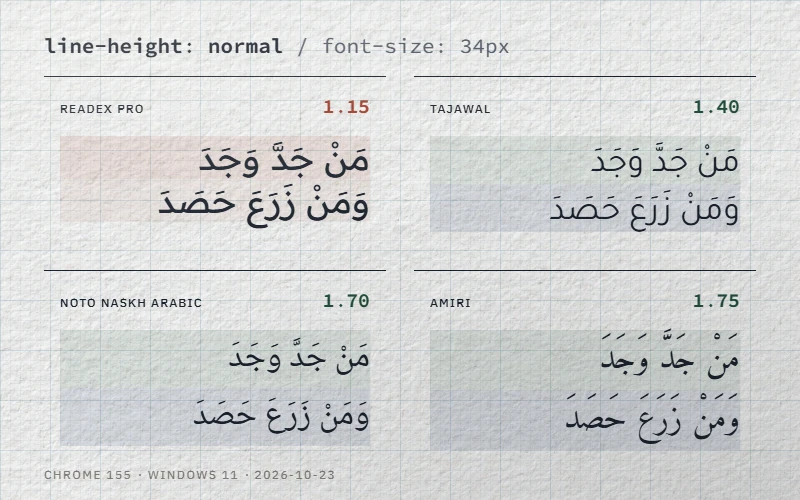
At 1.15, the shadda and fatha of one line come close to the descenders of the line above. Set an explicit value instead: 1.6 to 1.8 for Arabic body text, 1.3 to 1.4 for headings, and test with vocalized text, not plain letters.
letter-spacing
Arabic letters join, so spacing them apart would break the word. CSS Text Level 3 therefore says a browser that cannot stretch Arabic properly must not apply spacing between its letters at all. That is what we saw: with letter-spacing: .15em, Chrome 155 and Firefox 158 kept every join and added space only at the word space and around Latin text. The property is not dangerous in those browsers; it is useless, and it unbalances bilingual headings, where the Latin gets tracked and the Arabic does not. Reset it on Arabic text: :lang(ar) { letter-spacing: normal; } (here the descendant matching of :lang() is exactly what you want).
To widen Arabic for real, stretch the joins. Readex Pro has a Hyper Expansion axis, HEXP, from 0 to 100: with font-variation-settings: "HEXP" 100 on the variable file, the connections lengthen while every letter stays joined. Our preview subsets are static, so request the axis from the variable file (family=Readex+Pro:HEXP,wght@0..100,160..700 on Google Fonts).
Uppercase and italics
Arabic has no case: text-transform: uppercase leaves it unchanged. The risk is what usually comes with it in Latin themes, a tracked label or button style that Arabic inherits.
None of the families in this article ships an italic (Cairo’s variable file has a slant axis, which is not the same thing). Ask for one, through <em> or font-style: italic, and both browsers slanted the Arabic to the right: a mechanical Latin-style lean that reads as a rendering fault in Arabic. font-synthesis-style: none stopped it in both. Emphasize Arabic with weight or color instead.
Logical properties
Write margin-inline-start, padding-inline-end, border-inline-start and text-align: start instead of left and right. The same stylesheet then follows dir in both directions, without a second RTL file to maintain.
OpenType features worth enabling, carefully
Feature names live in the font itself; read them before you enable anything. A few we found:
- IBM Plex Sans Arabic:
ss06, “alternate letter Kaf”, changes the Kaf (ك) in Arabic text.ss01toss05only affect Latin (simple a, simple g, slashed or dotted zero, alternate eszett). - Amiri:
ss01lowers the dot of Baa (ب) after Raa (ر) or Waw (و),ss05places the kasra under the shadda instead of under the letter,ss08inverts the Arabic comma. - Readex Pro:
ss01toss03are Latin-only (single-storey a, double-storey g, I and J without bar). They do nothing to Arabic. - Noto Naskh Arabic: Arabic-Indic digits are tabular by default;
pnummakes them proportional. Usefont-variant-numeric: proportional-numsrather than the low-level property.
.brand-ar { font-feature-settings: "ss06" 1; }Two cautions. font-feature-settings does not add up: a value set on a child replaces the parent’s list, so repeat every feature you need. And a feature only works if your subset kept it, which is one more reason for --layout-features='*'.
Digits and bidi inside Arabic text
One font draws both Western digits (2026) and Arabic-Indic digits (٢٠٢٦); which ones you use is an editorial choice per market, not a CSS setting. The trap is mixed runs. In a right-to-left paragraph, we wrote اتصل بنا على (ittaṣil binā ʿalā, “call us at”) followed by +1 202 555 0143. Chrome displayed the four groups in reverse order, because the bidirectional algorithm resolves the spaces between number groups to the paragraph’s right-to-left direction. Wrapping the number in <bdi dir="ltr"> or <span dir="ltr"> restored it. Do the same for phone numbers, product codes and anything with several number groups.
Copy-ready checklist
<html lang="ar" dir="rtl">, andlang/diron every Arabic passage of a non-Arabic page.- One
@font-faceper weight, WOFF2 only,font-display: swaporoptional, Arabicunicode-range. - The font set on
html:lang(ar)or[lang|="ar"], not on a bare:lang(ar). - Subsets built with
--layout-features='*', tested with joined words, lam-alif and vocalized text. - One or two preloads, each with
crossorigin. - Explicit
line-heightof 1.6 to 1.8 for body text. letter-spacing: normalandfont-synthesis-style: noneon Arabic; emphasis by weight.- Logical properties throughout; number groups isolated with
<bdi>.
The same fonts also live on your computer for mockups: see how to install Arabic fonts on Windows, macOS and Linux. To pick the family itself, our guide on how to choose an Arabic font walks through the decision, and the catalog lists all Arabic fonts for websites and apps with their weights and licenses.