Arabic Sans Serif Font: Modern Families for Interfaces and Brands
37 fonts · Page 1 of 2
An Arabic sans serif font keeps strokes almost even and terminals simple, so it holds up on screens, signs and brand systems. Many free families here come as variable files, with weight, width or slant axes.
Style
Use
Access
License
What makes an Arabic font a sans
An Arabic sans keeps its strokes almost monolinear, with little contrast and simplified terminals. Many designs draw on Kufi geometry; others simplify the skeleton of Naskh. The style grew from the needs of screens, signage and brands, and it is often drawn together with a matching Latin.
How to tell a sans from a calligraphic face
- Even strokes: horizontals and verticals have nearly the same thickness.
- Plain terminals: strokes end flat or round, without the entry and exit marks of a reed pen.
- Open shapes: many designs keep counters open, which helps at small sizes and on modest screens.
- A visible skeleton: look for squared, Kufi-like letters or rounder forms reduced from Naskh. The Kufic fonts show where the first group comes from.
- A Latin partner: most families here include Latin letters designed to sit beside the Arabic.
Interfaces, signage and brand systems
An Arabic sans suits apps, websites, dashboards, presentations, signage and identities that run Arabic next to English. One family can cover a whole hierarchy, from a small label to a campaign headline. For product work, compare the Arabic web fonts; for two-script systems, the Arabic fonts with English.
Choosing an Arabic sans serif font by the job
Product interfaces. IBM Plex Sans Arabic fits teams already on the Plex system; its weights run from 100 to 700, with a SemiBold step between Medium and Bold for navigation states. Noto Sans Arabic helps when long labels must fit: alongside weight, from 100 to 900, its width can condense down to 62.5, and it supports Persian and Urdu. Vazirmatn, by Saber Rastikerdar, grew from the Vazir project toward websites and apps; it covers Persian and Arabic, with Roboto-based Latin, from 100 to 900.
Bilingual brands. Cairo pairs a Kufi-based Arabic with Latin derived from Titillium Web, and its variable file adds a slant axis to weights from 200 to 1000. Alexandria was developed as an Arabic companion to Montserrat; Montserrat itself is not in the download. Rubik has slightly rounded corners and separate upright and italic variable files, so emphasis does not depend on a synthetic slant.
Screens, reports and reading. Tajawal, from Boutros Fonts, runs from 200 to 900 with low contrast and open counters, a steady choice for dashboards and reports. Almarai, also from Boutros Fonts, keeps a compact set of four weights, with no Medium step between Regular and Bold. Readex Pro builds on Lexend's reading-oriented approach and adds a horizontal expansion axis; judge it with your readers, not by an accessibility label.
Persian-first families, monospace fonts (one aimed at code), signage-inspired designs and Kufi-based faces shared with the Kufi page also sit in the grid.
Arabic sans questions
Is a geometric Arabic font the same as a sans?
Not always. "Geometric" describes how letters are built, from straight lines and arcs. Tajawal and Almarai combine a geometric look with Arabic calligraphic structure, and Firjar, also in this grid, takes its name from the drawing compass. A sans can also be a simplified Naskh with no strict geometry.
Do I need a variable font?
Only if you will use the axes. A variable file holds a continuous range in one file, which helps with fine weight steps or width control on the web. Many fonts here ship as variable originals, while the previews show fixed positions: test other values in your own software.
Can an Arabic sans carry a long article?
It can on screen, at a comfortable size and line height. For a printed book or a classical text, a Naskh usually reads more naturally. Test a full page in both; the guide on how to choose an Arabic font covers screen versus print.
For a display headline above a sans text, browse the Arabic display fonts. Type real interface strings with the online Arabic keyboard and test them in the preview on a font's page, at the size of your labels.
Articles about Sans serif (modern)
Arabic Fonts in Canva: Find, Upload and Fix Them
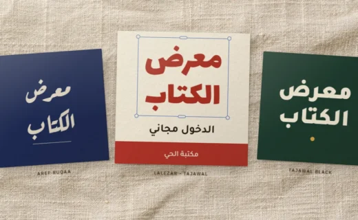
Find the Arabic fonts Canva already has, upload a free Arabic font to your Brand Kit with the right files, and fix reversed, boxed… Read more : Arabic Fonts in Canva: Find, Upload and Fix Them
Arabic Font CSS: A Tested Setup from @font-face to Bidi
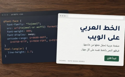
A tested Arabic font CSS setup: @font-face with an Arabic unicode-range, pyftsubset subsets that keep their features, preload with crossorigin, and the line-height, letter-spacing… Read more : Arabic Font CSS: A Tested Setup from @font-face to Bidi
Arabic Text in Photoshop, Illustrator and InDesign: Setup Guide
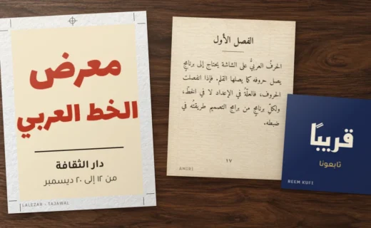
Photoshop now shapes Arabic on its own; Illustrator and InDesign still need the right composer. Exact menu paths for direction, digits, diacritics and kashida,… Read more : Arabic Text in Photoshop, Illustrator and InDesign: Setup Guide
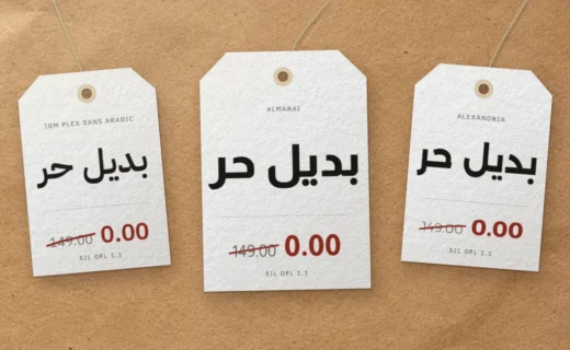
Free Alternatives to Commercial Arabic Fonts: GE SS, Dubai, DIN Next
GE SS Two, Dubai Font, DIN Next Arabic, Janna, 29LT Bukra, Hacen: who owns each one, what its license allows, and the open-licensed fonts… Read more : Free Alternatives to Commercial Arabic Fonts: GE SS, Dubai, DIN Next
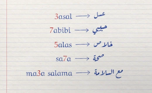
Arabizi Explained: Why 3, 7 and 5 Stand for Arabic Letters
Why texters write 3 for ع and 7 for ح, an Arabizi numbers chart, what a 2025 survey in five countries found about regional… Read more : Arabizi Explained: Why 3, 7 and 5 Stand for Arabic Letters
Arabic in Microsoft Word: Fonts, Right-to-Left, Diacritics and Sharing
Set the complex script font, right-to-left paragraphs and tables, harakat, Arabic or Hindi digits and kashida, then pick a font Word can embed and… Read more : Arabic in Microsoft Word: Fonts, Right-to-Left, Diacritics and Sharing