Free Alternatives to Commercial Arabic Fonts: GE SS, Dubai, DIN Next
Free alternatives to commercial Arabic fonts are not clones, and none of the fonts below copies a retail design. They share the traits that make the commercial family look the way it does: the skeleton, the shape of the bowls, the cut of the terminals, the weight range. We compared each candidate with the publisher’s own specimen, measured it against Dubai Font, the one commercial family we could install, and checked every license at the source.
Why the most popular Arabic fonts are rarely free
The Arabic type you see on Gulf ministries, telecom ads and news channels is often a retail family or a custom design. Monotype, Linotype, Boutros and 29Letters sell these fonts per computer, per website or per app.
Boutros, which publishes GE SS Two, answers this on its own site: apart from offers on its website, it gives none of its fonts to any download site, and it says that many agencies, broadcasters and universities in the region do not respect the rights to its Arabic fonts. A font file from a portal does not come with a license. The company that ships it in a logo, an app or a TV package carries the risk.
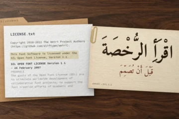
An open license removes the problem. Every downloadable family in our catalog is under the SIL Open Font License 1.1, the GPL with font exception or Apache 2.0: commercial use, embedding in apps and websites, and modification are allowed. The OFL, which covers every alternative below, only forbids selling the font on its own. For the details, right by right, see how Arabic font licenses work. Our selection of the best free Arabic fonts covers all styles. This guide starts from the other end: the commercial font you already know.
How we matched each font
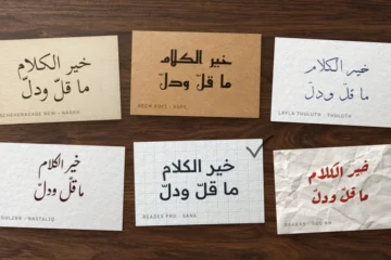
We never compared against copies from download sites. Every reference is the publisher’s own specimen, viewed on October 23, 2026: the type testers on MyFonts for the Monotype and Linotype families, the specimen pages of Boutros, 29Letters and hacen.net. Where a type tester was available, we typed the opening of the classic Arabic pangram, نص حكيم له سر قاطع (naṣṣ ḥakīm lahu sirr qāṭiʿ, “a wise text with a decisive secret”), then set the same line in each free candidate at the same size. Elsewhere, we set the publisher’s own sample sentence.
Six criteria decide a match, in this order:
- Skeleton. Is the design built on Naskh (curved ح and ع, a calligraphic stroke order) or on a geometric, Kufi-like frame (flat joins, circular counters)?
- Bowls and teeth. The roundness of ص ف ع, the height of the teeth in ـسـ.
- Terminals and contrast. Flat, angled or rounded cuts; strictly monoline or with a trace of pen modulation.
- Proportions. Line length at equal size, ascender height (the alif), descender depth.
- Weights. The range, and whether italics or condensed widths exist.
- Latin companion. Its style and x-height, which decide how a bilingual line looks.
We also measured line length, alif height and Latin x-height for every candidate at 100 px, weight 400, on the line الخط الحسن يزيد الحق وضوحًا (al-khaṭṭ al-ḥasan yazīd al-ḥaqq wuḍūḥan, “fine writing makes the truth clearer”). Dubai Font, which Monotype says is available in Microsoft Office 365, was measured from the copy installed on our Windows 11 test machine.
Two rules we kept: no commercial font appears in our images, and a look-alike is never a license to imitate someone else’s logo.
Free alternatives to commercial Arabic fonts: the comparison table
| Commercial font | Free alternative | What matches | What changes | Best use |
|---|---|---|---|---|
| GE SS Two (Boutros) | Almarai | Geometric skeleton on a flat baseline, circular counters, straight ascenders | No italic; 4 weights (300–800) | Brand text, packaging, UI |
| GE SS Two (Boutros) | Tajawal | Same geometric logic, wider weight range (200–900) | Shorter alif, slightly lighter color on the page | Interfaces, signage, display sizes |
| Dubai Font | Noto Sans Arabic | Naskh-based sans skeleton, curved ح and ع | About 8% longer lines; larger Latin x-height | Body text, reports, websites |
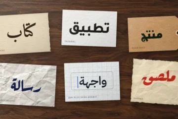
| Dubai Font | IBM Plex Sans Arabic | Low contrast, compact line | Crisper, angled terminals; Latin is a grotesque | Tech, finance, dense UI |
| DIN Next Arabic | Readex Pro | Monoline, round, geometric; Arabic drawn by the same designer | Widest line of the group; no Black | Headlines, apps, signage |
| Frutiger Arabic | IBM Plex Sans Arabic | Humanist frame with angled cuts | No condensed width | Corporate text, wayfinding |
| Neue Helvetica Arabic | Noto Sans Arabic or Vazirmatn | Naskh-derived, low-contrast, neutral | Nine weights instead of three | Body text, documentation |
| Janna (Linotype) | Cairo | Kufi-based, compact, friendly terminals | Much wider weight range (200–1000) | Signage, UI, social media |
| 29LT Bukra | Alexandria or Changa | Geometric Kufi frame, open forms | No width axis; Alexandria’s alif is taller | Headlines, campaigns, logotypes (Changa: unvocalized only) |
| Hacen Tunisia, Hacen Liner | Changa or Cairo | Compact, flat, low-contrast display | Wider weight range (200–800 / 200–1000) | Posters, video titles (Changa: unvocalized only) |
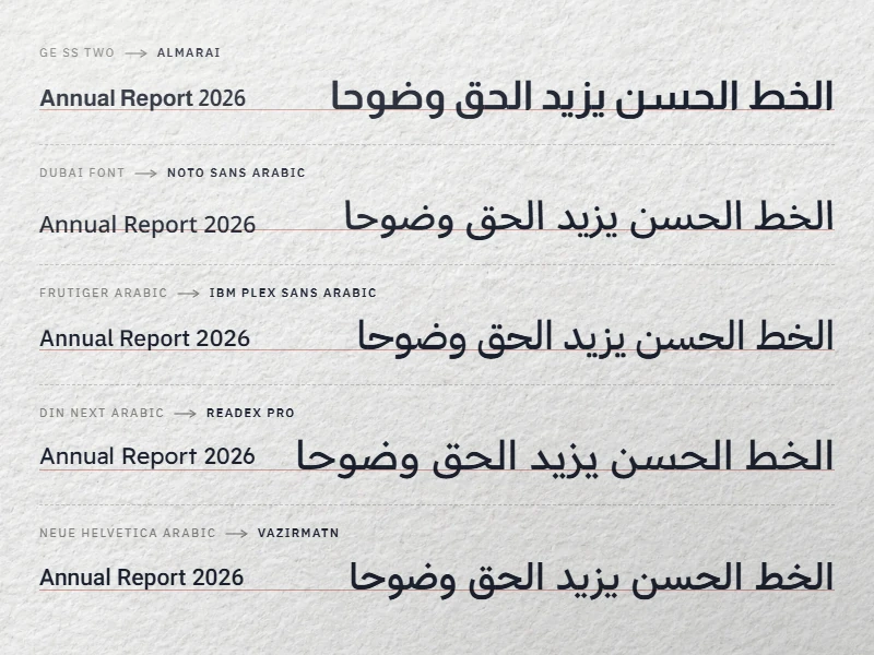
GE SS Two alternative: Almarai, Tajawal or Zain
GE SS Two is a Boutros design, sold by the foundry as an OpenType family of five styles: Light, Medium and Bold, plus Light Italic and Medium Italic. On October 23, 2026 the family pack was listed at £160, with web fonts on request. Boutros describes a modern geometric style that still follows calligraphic rules, with straight joins sitting on the Latin baseline so that it pairs with Helvetica, Futura or Frutiger. Other “GE SS” names circulate on download sites; the Boutros catalog we checked lists only GE SS Two and GE SS MAP.
The closest free match comes from the same foundry. Almarai, drawn by Boutros Fonts and Mourad Boutros, shares the principles we see on the Boutros specimen line إذا أوْمَأ الحُبُّ إليكمْ فاتبعوْه (idhā awmaʾa al-ḥubbu ilaykum fa-ttabiʿūh, “when love beckons to you, follow him”, from Kahlil Gibran’s The Prophet): circular counters in ف, ع and و, a tall straight alif and lam, flat joins on the baseline. What you lose is the italic; what you get is four weights (Light 300 to ExtraBold 800) that you can embed anywhere.
Tajawal, by Boutros Fonts, Mourad Boutros and Soulaf Khalifeh, has the same family resemblance and seven weights from 200 to 900. On our test line it runs about 3–4% longer than Almarai, and its alif is shorter (65 px against 72 px at a 100 px font size), which makes a page look a little lighter and more horizontal. Zain, a third Boutros design in our catalog, is softer and much wider: 16% longer than Almarai on the same line, with Light and Regular italics.
Pick Almarai when you replace GE SS Two in brand text and packaging; pick Tajawal when you need ExtraLight or Black for interfaces and big signage.
Dubai Font alternative: free to download is not a free license
Dubai Font was commissioned by The Executive Council of Dubai and designed by Monotype, with Nadine Chahine leading the team, in partnership with Microsoft. Arabic and Latin were drawn together, in four weights: Light, Regular, Medium, Bold. It costs nothing. It is not open.
The official site, dubaifont.com, did not respond when we checked, so we read the End User Licence Agreement for Dubai Font as mirrored by Font Squirrel. Its main limits:
- Scope. A free, limited, revocable license to install and use the font for your own personal or internal business purposes.
- Websites and marketing. Allowed, but the font must be embedded so that visitors cannot extract it. A standard web font file can be downloaded by any browser; whether that satisfies the clause is a question for your lawyer.
- Apps. Embedding is allowed only in a protected way, and never in an app that lets users produce PDFs, documents or images, nor in a server component.
- No changes, no sharing. No modification, no derivative work, and no handing the files to anyone without written consent from the Council. An agency working for you may use the font for your digital products, then must delete it.
- No open source. You must not do anything that would place the font under an open-source license.
- Revocable. The Council can end the license with seven days’ notice, can change the terms at any time, and can ask for records of your use.
That is fine for an internal slide deck. It is a poor base for an open-source app, a print job where the printer needs the font files, or a brand that must outlive a policy change.
Noto Sans Arabic is the closest skeleton: a Naskh-based sans with the same curved ح and ع, nine weights and a width axis. On our test line it runs about 8% longer than Dubai, and its Latin x-height is clearly larger (54 px against 44 px), so bilingual lines look bigger at the same point size. IBM Plex Sans Arabic, drawn for IBM by Bold Monday with Khajag Apelian and Wael Morcos, is only 5% longer and has the shortest descenders of the group; its angled terminals feel more technical than Dubai’s soft ones. Vazirmatn, by Saber Rastikerdar, matches Dubai’s alif height almost exactly (68 px, rounded) and runs 8% longer.
Al Jazeera Arabic font: a house typeface with no public license
Files named “Al Jazeera Arabic” circulate on free-font sites. We found no retail listing at Monotype, MyFonts or any other foundry we checked, and no public license. What is documented is the design work: Nadine Chahine’s studio lists Al-Jazeera among the clients for whom she designed Arabic typefaces during her years at Linotype and Monotype. A custom corporate font is licensed to its owner, not to the public.
With no official specimen to compare against, we do not claim a look-alike. For the same job, news graphics, lower thirds, tickers and screen headlines, our picks are Noto Kufi Arabic for sturdy headlines in nine weights, IBM Plex Sans Arabic for subtitles and body text, and Tajawal when a caption bar is short of space.
DIN Next Arabic, Frutiger Arabic and Neue Helvetica Arabic alternatives
These three Monotype and Linotype families share a designer. The MyFonts listings credit Nadine Chahine on each Arabic version: with Akira Kobayashi and the Linotype Design Studio for DIN Next Arabic, with Adrian Frutiger for Frutiger Arabic, and with Max Miedinger and the Linotype Design Studio for Neue Helvetica Arabic. On October 23, 2026, a desktop license started at US$155.99 per style for DIN Next Arabic and US$149 for the other two.
| Commercial family | Styles on MyFonts | Free alternative | Weights |
|---|---|---|---|
| DIN Next Arabic | 7, UltraLight to Black | Readex Pro; Noto Kufi Arabic | 160–700; 100–900 |
| Frutiger Arabic | 8: four weights, each also condensed | IBM Plex Sans Arabic | 100–700 |
| Neue Helvetica Arabic | 3: 45 Light, 55 Roman, 75 Bold | Noto Sans Arabic; Vazirmatn | 100–900; 100–900 |
DIN Next Arabic. On the type tester, the Arabic is strictly monoline, with round, open bowls and a flat top stroke on ح. Readex Pro has the same calm geometry, and its Arabic was drawn by Nadine Chahine, as the project’s README credits. It is the widest of the Monotype candidates (21% longer than Dubai on our line) and stops at Bold 700. When you need weights above Bold, Noto Kufi Arabic goes to 900 with a sturdier Kufi frame.
Frutiger Arabic. The specimen shows a humanist design, monoline, with terminals cut at an angle. IBM Plex Sans Arabic has the same angled cuts and low contrast. It has no condensed width; for narrow columns, set it one weight lighter and slightly tighter rather than faking a condensed style.
Neue Helvetica Arabic. A low-contrast Naskh-derived sans, neutral by design. Noto Sans Arabic follows the same model and gives you nine weights instead of three. Vazirmatn is a little darker and rounder, and handy when the project also needs Persian.
Janna, 29LT Bukra and Hacen alternatives: Cairo, Alexandria, Changa
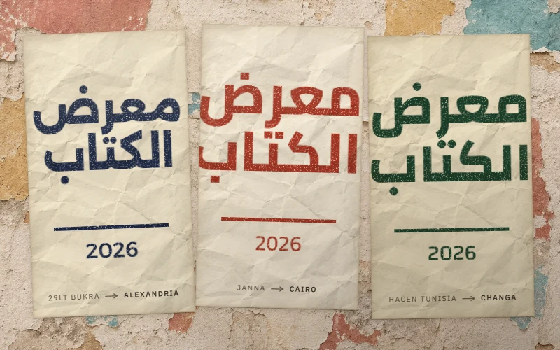
Janna. Linotype sells Janna in Regular and Bold on MyFonts, from US$40.99 per style on October 23, 2026. Its listing describes a humanist Kufi with Ruq’ah and Naskh letterforms, first drawn by Nadine Chahine in 2004 as a signage face for the American University of Beirut. Cairo, by Mohamed Gaber, is our match: Kufi-based, compact, with the same friendly rounded joins, and weights from 200 to 1000. Tajawal is a calmer second choice.
29LT Bukra. 29Letters describes Bukra (بكرة, bukra, “tomorrow”) as a geometric design on a Kufi structure, with large open proportions and very short ascenders and descenders. The system has 94 styles: Hairline to Black, five widths, upright and slanted. Alexandria, by Mohamed Gaber and Julieta Ulanovsky, has the same wide, round geometry, but its alif is the tallest of our group (82 px); in a tight headline, increase the leading. Changa is the closer fit for Bukra’s squat profile: its alif is the shortest we measured (63 px). Keep Changa for words without vowel marks: in our October 2026 test, confirmed with its original file, it detached the shadda and its vowel from the letter.
Hacen. The Hacen families (Hacen Tunisia, Hacen Liner, Hacen Saudi Arabia…) are by Hacen, a designer based in Nouakchott, Mauritania. His site, hacen.net, offers downloads behind a checkbox that accepts a usage agreement. On October 23, 2026, the agreement page linked from that checkbox returned a “not found” error. A license you cannot read is not one you can show a client. For Hacen’s compact, flat headline look, Changa and Cairo are the safe replacements.
Switching an existing brand to a free font
- Map weights by stem thickness, not by name. One family’s Medium can be another’s Regular. Print the stems side by side.
- Re-test line length with real copy. On our test line, the candidates run from 5% (IBM Plex Sans Arabic) to 25% (Zain) longer than Dubai. Headlines that fitted on one line may wrap.
- Check the Latin. The x-height of the companion Latin changes the look of every bilingual line. Our guide to all fonts for bilingual Arabic and Latin layouts lists families with a matched Latin.
- Check digits and punctuation. Test Western and Arabic-Indic digits, the Arabic comma and question mark before you sign off.
- Archive the license. Keep the font’s
OFL.txtorLICENSE.txtwith the brand assets. It is the document a client or printer will ask for.
If none of the alternatives fits, the problem may be the brief rather than the font. Our method for choosing an Arabic font for a project starts from the use, the sizes and the copy.
FAQ
Is Dubai Font free for commercial use?
Partly. Its license allows personal and internal business use and digital products such as websites and ads, under conditions. It forbids redistribution and modification, restricts embedding in apps, and can be ended by the Council with seven days’ notice.
Can I use GE SS Two if a website offers it for free?
No. Boutros states that it gives its fonts to no download site. Without a license bought from the foundry, the file is unlicensed, whatever the site claims.
Can I use these free alternatives in a logo?
Yes. The SIL Open Font License allows commercial use, including logos, and lets you modify the letters. It does not let you sell the font on its own. Your logo can usually be registered as a trademark; the font stays free for everyone else.