Arabic Calligraphy Styles Compared: A Visual Key to Nine Scripts
Arabic calligraphy styles differ less in their letters than in their geometry: the same word can sit on a flat line, slide down in steps or climb toward its end. This guide gives you a visual key to the scripts you are most likely to meet, a table to compare them, and, for each, the page with its history and the free fonts that come closest.
How to tell Arabic calligraphy styles apart: a four-step key
Calligraphy (خط, khatt) follows rules of proportion, so each style keeps the same habits from one word to the next. Look for them in this order:
- Corners or curves. Mostly straight strokes meeting at angles point to Kufi. Everything else is a cursive hand.
- The alif (ا). The first letter of the Arabic alphabet is a plain vertical stroke, which makes its height easy to compare. A very tall, straight alif rising far above the other letters suggests Thuluth or Muhaqqaq. A short one, barely above the line, suggests Ruq’ah. In Naskh it sits in between.
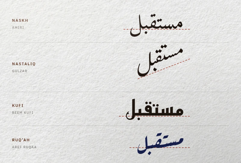
- The baseline. Level words: Naskh, Ruq’ah, Kufi. Each word stepping down from right to left: Nastaliq. A whole line climbing toward its end on the left: Diwani. Letters on several levels in one block: Thuluth.
- Details that settle the case. A س (sin) without teeth and dots merged into dashes point to Ruq’ah. A ف (fa’) with its dot below and a qaf with a single dot above mean Maghribi.
Then check the setting. A wedding card or a diploma leans toward Diwani, a mosque frieze toward Thuluth, a handwritten note toward Ruq’ah, an Urdu newspaper toward Nastaliq.
The styles side by side
| Style | Strokes | Alif | Baseline | Typical use | Free font closest to it |
|---|---|---|---|---|---|
| Kufi | Angular, long horizontals | Straight shaft | Level, emphasized | Early Qurans, architecture, logos | Reem Kufi, Qahiri |
| Naskh | Round, moderate contrast | Medium | Level | Books, press, printed Qurans | Amiri |
| Thuluth | Wide curves, tall shafts | Very tall | Letters stacked on levels | Titles, inscriptions | Layla Thuluth, Tholoth: letters on one line |
| Muhaqqaq, Rayhani | Sharp, angled edges | Tall | Level | Large and fine Quran copies | None |
| Tawqi’, Riqa’ | Chancery forms near Thuluth | Medium | Level | Signatures, letters | None |
| Diwani | Rounded, slanted, overlapping | Leaning | Rises toward the left | Invitations, diplomas | Layla Diwani: letters on one line |
| Ruq’ah | Quick, low contrast | Short | Level, compact | Handwriting, signs, posters | Aref Ruqaa, Rakkas |
| Nastaliq | Strong contrast, long sweeps | Thin | Each word steps down | Persian poetry, Urdu | Gulzar, Noto Nastaliq Urdu |
| Maghribi | Wide final curves | Straight | Level | Maghreb and West Africa, Warsh Qurans | None; Kano fonts as approximations |
“Free” here means a license that lets us host the file: all the fonts named above are under the SIL Open Font License 1.1, except Tholoth, which uses the GPL with font exception.
Kufi, the angular family
Kufi (كوفي, kufi) is the only major style built on corners. Its long horizontals pull words along the line, and its decorative branches add leaves, flowers or braids, or lock the letters into a square grid on walls. It is the hand of many early Qurans on parchment and of monumental inscriptions.
Today it is also the skeleton of many modern Arabic sans faces. The free Kufi fonts therefore run from manuscript revivals to signage families. Reem Kufi follows early manuscript and Fatimid models; Qahiri, named for Cairo, revives manuscript Kufi as regularized by the calligrapher Mohammad Abdul Qadir.
The proportioned pens: Naskh, Thuluth and the rarer four
Classical calligraphy counts six cursive “pens” (الأقلام الستة, al-aqlam al-sitta): Naskh, Thuluth, Muhaqqaq, Rayhani, Tawqi’ and Riqa’. Tradition credits the Abbasid vizier Ibn Muqla with codifying them in the 10th century, measuring each letter in dots of the pen against the height of the alif, and Yaqut al-Musta’simi (died 1298) with refining them, as the Library of Congress summarizes.
Naskh
Naskh (نسخ, naskh) is round, clear and calm: the copyists’ hand that became the standard for books, newspapers and most printed Qurans. If you read Arabic every day, you read a descendant of it. The Naskh fonts start with Amiri, a revival of the Bulaq Press type of Cairo.
Thuluth
Thuluth (ثلث, thuluth) is Naskh’s monumental cousin: taller shafts, wider curves, and letters stacked in a composition that the calligrapher arranges for each phrase. You see it on mosque friezes, surah headings and the Saudi flag, whose 1973 flag law requires the shahada in Thuluth, according to Saudipedia (in Arabic). The page on Thuluth calligraphy explains its masters and its compositions.
Muhaqqaq and Rayhani, Tawqi’ and Riqa’
You will meet these four mostly in museums. Muhaqqaq (محقق, muhaqqaq) is recognizable by its sharp, angled edges; its widest use came in the Mamluk era, for large Qurans. Rayhani (ريحاني, rayhani) is its smaller version. Tawqi’ (توقيع, tawqi’), a variation on Thuluth, served mostly for rulers’ signatures and colophons, and Riqa’ (رقاع, riqa’) served for correspondence. None has a free font in our catalog.
Ottoman hands: Diwani and Ruq’ah
Diwani (ديواني, diwani) was the script of the Ottoman chancery. Letters lean, overlap and ride a line that climbs toward its end; its jali form fills every gap with dots and small signs. It now appears on wedding invitations and diplomas. The page on the Diwani script covers its origins and its jali form.
Ruq’ah (رقعة, ruq’a), a 19th-century Ottoman codification, is the opposite: short letters, little contrast, no wasted stroke. It became the everyday handwriting of much of the Arab world. Do not confuse it with the older Riqa’ above. Among the Ruq’ah fonts, Aref Ruqaa stays closest to classical calligraphy; Rakkas leans toward Egyptian film posters.
Nastaliq, Maghribi and other regional scripts
Nastaliq (نستعليق, nasta’liq) grew in Iran and became the hand of Persian poetry and of printed Urdu. Each word slopes down from right to left, then the next starts high again; thick and thin strokes contrast sharply. The free Nastaliq fonts for Urdu, Gulzar and Noto Nastaliq Urdu among them, were drawn for Urdu readers first.
Maghribi (مغربي, maghribi) is the script of the Maghreb and al-Andalus, still used for Qurans, mostly in the Warsh reading. Its wide final curves and its fa’ and qaf, which place their dots differently from eastern scripts, make it easy to spot and easy to misread. The page on Maghribi script lists Alkalami and Ruwudu, two fonts based on Kano writing from Nigeria and Niger: useful relatives, not Maghribi proper. Give Alkalami generous line spacing: on our test page, its lines overlapped at a line height of 1.9.
Two more names come up in museum labels. Sini is the Arabic calligraphy of Chinese Muslims, sometimes written with a brush; in 2023 the Museum für Islamische Kunst in Berlin devoted a solo exhibition, With Brush and Qalam, to Haji Noor Deen, a Chinese master of the style. Sudani covers West African hands of Maghribi descent. Neither has a free font we could host.
Three comparisons people ask about
Naskh vs Kufi
Look at the bowls. Naskh draws ن and ي as round cups that dip below the line; Kufi flattens them into straight strokes and corners. If a letter that should curve looks folded, it is Kufi or a sans derived from it.
Ruq’ah vs Naskh
Look at the sin and the dots. Naskh writes س with three teeth and keeps every dot separate; Ruq’ah draws one smooth stroke and often merges two dots into a dash. Ruq’ah letters also hug the baseline, with short tails.
Nastaliq vs Naskh
Look at the end of each word. In Naskh it ends on the same line where it started; in Nastaliq it ends lower, so a sentence reads as a staircase. That slope is the script itself, not an italic, and no slant setting turns a Naskh font into Nastaliq.
From pen to font: what is missing
A font lines letters up and swaps shapes by context; a calligrapher composes. Scripts that live on the line, Kufi, Naskh, Ruq’ah and Nastaliq, translate into fonts. Scripts that live on stacked, overlapping compositions, Thuluth and Diwani, do not, or only in part. Layla Thuluth, Tholoth and Layla Diwani give you their letterforms on a single baseline, enough for a short name or heading. Each has limits: the two Layla files have no mark-positioning table, so harakat sit at fixed heights. Layla Diwani carries a restricted embedding flag, so Word and PDF tools refuse to embed it or swap in another font; Tholoth’s flag lets a document embed it for viewing and printing only, not editing. Our tested selection of free Arabic fonts details these limits. For a logo, a framed verse or a wedding name composed in those styles, commission a calligrapher. Maghribi is a different gap: its distinctive conventions are few, but few digital fonts apply them.
FAQ
How many Arabic calligraphy styles are there?
There is no fixed count. The classical canon has six pens; Kufi, Diwani, Ruq’ah, Nastaliq and Maghribi come from other periods and regions; and each style has variants, such as square Kufi or Diwani jali. The table above covers what you will meet in print, on buildings and in design work today.
Which style is used in the Quran?
The earliest Qurans were copied in Hijazi script, then in Kufi; later ones in the cursive pens. Most printed Qurans today are in Naskh; in the Maghreb and West Africa, many are written in Maghribi.
Is Arabic calligraphy on the UNESCO heritage list?
Yes. Arabic calligraphy: knowledge, skills and practices was inscribed on UNESCO’s Representative List of the Intangible Cultural Heritage of Humanity in 2021, on a nomination by 16 Arab states. UNESCO also marks World Arabic Language Day every 18 December.