Naskh Font Choices for Books, Long Reading and Vocalized Text
26 fonts · Page 1 of 2
Choose a naskh font for books, reports and vocalized text. The free fonts below run from a revival of Bulaq Press type to variable files for multilingual publishing, with Persian-first and South Asian designs in the same list.
Style
Use
Access
License
Naskh script, from Baghdad copyists to Cairo type
Naskh (نسخ, naskh) is one of the six pens (الأقلام الستة, al-aqlam al-sitta) of classical calligraphy, with Thuluth, Muhaqqaq, Rayhani, Tawqi' and Riqa'. Ibn Muqla, a vizier in Baghdad who died in 940, is credited with the proportioned script (الخط المنسوب, al-khatt al-mansub): each letter is measured in rhombic dots of the pen and against the height of the alif (ا).
Ibn al-Bawwab, also in Baghdad, refined that system before his death in the early 11th century. The line continues with Yaqut al-Musta'simi (died 1298) and the Ottoman calligrapher Hafız Osman (1642–1698), whose Naskh copies of the Quran served as models. Later, the Bulaq Press in Cairo developed a Naskh metal type that is the source of Amiri. Over time Naskh became the standard for books, the press and most printed Qurans.
How to recognize a Naskh
- Round forms: bowls and tails curve smoothly, with few sharp corners.
- Moderate contrast: strokes vary in thickness, as a cut pen makes them, without the strong contrast of Nastaliq.
- Clear letters: each letter keeps a distinct shape, so words read without guesswork.
- Well-placed marks: dots and harakat (حركات, short-vowel marks) sit close to their letter, which makes fully vocalized text practical.
- Small-size legibility: it holds up at the sizes of book pages, newspaper columns and footnotes.
Books, press, Quran and everyday documents
Choose Naskh when people will read more than a few lines: novels, textbooks, reports, articles, contracts. It is also the expected style for vocalized religious text. For print projects, compare the Arabic fonts for books. For verses that need the full set of Quranic signs, see the Quran fonts, checked for those marks.
For buttons and small labels, switch to one of the Arabic sans serif fonts: their low contrast holds up at small sizes. For titles and logos, the Kufi fonts page weighs Kufi against Naskh.
Which Naskh font to choose
For a classical voice, take Amiri: Khaled Hosny and Sebastian Kosch revived the Bulaq Press type, keeping strokes that swell and taper like a pen's. Pick it for literature, history and religious books in Regular or Bold. Amiri Quran, its Quran-oriented sister, is a separate single-weight family with signs such as the end-of-ayah mark.
Pick Noto Naskh Arabic when a publisher works across Arabic, Persian and Urdu and wants one family with intermediate weights between 400 and 700. Noto Naskh Arabic UI is a separate family.
Choose Scheherazade New, from SIL, for teaching material and academic text that need a quiet hierarchy across four upright weights. Older files named Scheherazade may not match this release, so record the version you install.
Use Markazi Text for articles and editorial pages. Its moderate contrast and coordinated Latin came out of a project between the University of Reading and Google, with Borna Izadpanah drawing the Arabic.
Mirza leans toward Persian: KB Studio drew its ligatures with Persian as well as Arabic aesthetics in mind, in four weights. Use it for mixed Arabic–Persian pages.
Choose Lateef when your readers write Sindhi or another South Asian language. SIL named it after the poet Shah Abdul Lateef Bhitai and drew it with that context in mind, and its seven weights give a long text many levels.
Alyamama, by Yazeed Omar, gives a classical Naskh skeleton sharper, simplified strokes. Its variable file opens at weight 300, the light end of its range, so check which weight your software opens.
Persian-first reading faces and archived screen designs also sit in the grid; check each one's languages.
Naskh questions
How is Naskh different from Ruq'ah?
Ruq'ah is a quick, compact hand: short letters, little contrast, dots often joined into strokes. Naskh is fuller and slower, with marks placed for reading. That is why Naskh carries paragraphs while Ruq'ah fonts stay in titles and signatures. The guide on how to choose an Arabic font sets both beside modern sans.
How much line height does a Naskh text need?
More than a Latin text face. Tall ascenders, deep descenders and marks over and under the letters all need room; for Amiri, a value between 1.7 and 1.9 is a sensible start. A mark can be present yet badly placed, so judge the rendered line. Type your most heavily vocalized line with the online Arabic keyboard, paste it into the preview on a font's page, and raise the spacing until no marks touch.
Articles about Naskh
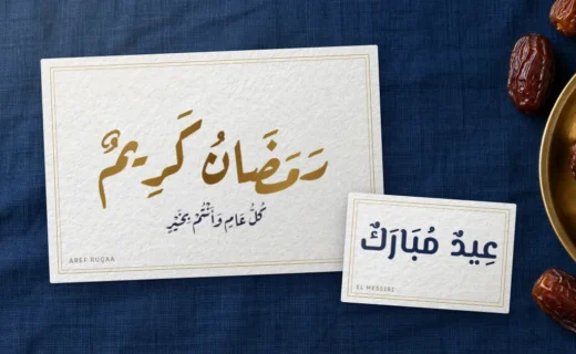
Ramadan Kareem in Arabic and Eid Mubarak: Spelling, Meaning, Lettering
Every Ramadan and Eid greeting with its exact Arabic spelling, vowel marks, meaning and reply, the Kareem or Mubarak debate, and free fonts tested… Read more : Ramadan Kareem in Arabic and Eid Mubarak: Spelling, Meaning, Lettering
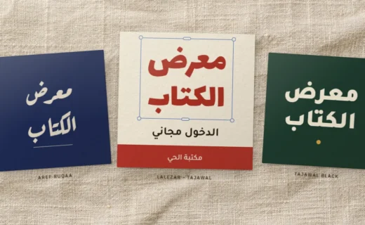
Arabic Fonts in Canva: Find, Upload and Fix Them
Find the Arabic fonts Canva already has, upload a free Arabic font to your Brand Kit with the right files, and fix reversed, boxed… Read more : Arabic Fonts in Canva: Find, Upload and Fix Them
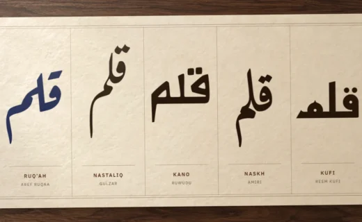
Arabic Calligraphy Styles Compared: A Visual Key to Nine Scripts
Kufi, Naskh, Thuluth, Diwani, Ruq'ah, Nastaliq, Maghribi and the rarer pens: how to tell them apart by angle, alif and baseline, where each one… Read more : Arabic Calligraphy Styles Compared: A Visual Key to Nine Scripts
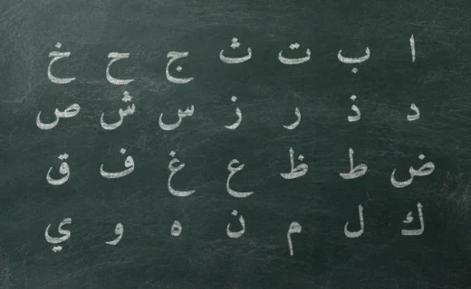
The Arabic Alphabet: 28 Letters, Their Forms and How They Join
All 28 Arabic letters in their four forms, with ALA-LC transliteration and IPA, the six letters that never join forward, dot families, the sounds… Read more : The Arabic Alphabet: 28 Letters, Their Forms and How They Join
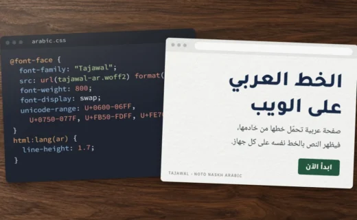
Arabic Font CSS: A Tested Setup from @font-face to Bidi
A tested Arabic font CSS setup: @font-face with an Arabic unicode-range, pyftsubset subsets that keep their features, preload with crossorigin, and the line-height, letter-spacing… Read more : Arabic Font CSS: A Tested Setup from @font-face to Bidi
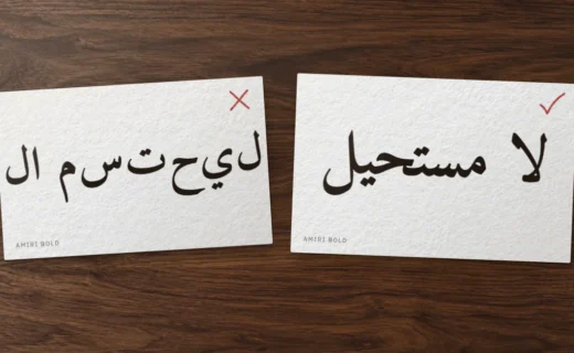
Arabic Letters Not Connecting or Reversed? Causes and Fixes by App
Separated letters, reversed words, boxes or a full stop on the wrong side: one test line tells you whether the app, the font or… Read more : Arabic Letters Not Connecting or Reversed? Causes and Fixes by App