Thuluth Font Guide: Thuluth Calligraphy and Free Alternatives
2 fonts
Try Layla Thuluth, a free single-weight interpretation from Mohammed Isam. This page explains the style and the difference between reusable letterforms and a custom stacked composition.
Style
Use
Access
License
Thuluth, a classical pen for titles and monuments
Thuluth (ثلث, thuluth) takes its place among the six pens (الأقلام الستة, al-aqlam al-sitta) as a large script for titles and inscriptions. Its masters include Yaqut al-Musta'simi, who died in 1298, and the Ottoman calligraphers Şeyh Hamdullah (1436–1520) and Hafız Osman (1642–1698).
Thuluth jali (الثلث الجلي, al-thuluth al-jali) is its monumental version. It is the script of mosque inscriptions, domes and pediments.
Reading a Thuluth composition
- Large curves: bowls and tails sweep in wide arcs.
- Tall shafts: the alif, the lam and other vertical strokes rise high above the line.
- Stacked letters: the calligrapher places letters and words on several levels in one composition, the tarkib (تركيب, tarkib).
- Decorative vowels: harakat (حركات, short-vowel marks) and small signs fill the gaps and become part of the design.
Where Thuluth calligraphy appears
Thuluth is used for surah titles and book titles, for inscriptions and for formal invitations. On a wedding card or an event title, the free faces in the Arabic wedding invitation fonts cover the names and practical lines. For artwork in a hand that does have free fonts (Ruq'ah, Nastaliq, Kano), see the Arabic calligraphy fonts.
Why a free Thuluth font is so hard to find
Thuluth draws its beauty from stacked compositions that a calligrapher arranges by hand for each phrase. A font sets letters along a line. To come close, it needs a very large set of ligatures and contextual forms, and a shaping engine able to choose between them. That is long, specialized work.
Layla Thuluth is a free single-weight design published by Mohammed Isam on FontLibrary. Try a short title, then inspect its spacing and marks. Its reusable forms do not automate a calligrapher's stacked composition. Check any other download's license and original source before using it in a client project.
Katibeh, a Naskh with Thuluth details
Katibeh, a KB Studio headline face, starts from Naskh and borrows a few Thuluth traits. Its small outward strokes read as archaic next to otherwise contemporary forms. It is no full Thuluth and no substitute for a calligrapher's composition, so do not call the final design "Thuluth".
It has one weight and covers Arabic, Persian and Latin, with a Latin scaled to sit beside the Arabic. Use it for a book title, a cultural program heading or an invitation. Set the text below it in one of the Naskh fonts, which carry long reading better.
For a mosque inscription, a framed verse or a monogram, commission a calligrapher. A font can suggest Thuluth; the tarkib still needs a hand.
Thuluth questions
Why is it called Thuluth?
The word means "one third". Explanations differ. One links it to the share of straight strokes against curves; another to the width of its pen compared with a larger pen.
Is Thuluth the same as Naskh?
No. Both belong to the six pens, but Naskh became the style of books and running text, while Thuluth is larger and taller, made for titles and inscriptions.
What should I send a calligrapher?
The exact text in Arabic script, with any vowels you want shown, checked by a native reader. You can type a name with the online Arabic keyboard, but do not rely on a transliteration alone. Add the final size and format, so the composition fits its space.
The Diwani script, the Ottoman chancery hand, offers another ornamental direction, including Layla Diwani. To weigh display and text faces for a project, read the guide on how to choose an Arabic font.
Articles about Thuluth
Arabic Calligraphy Styles Compared: A Visual Key to Nine Scripts
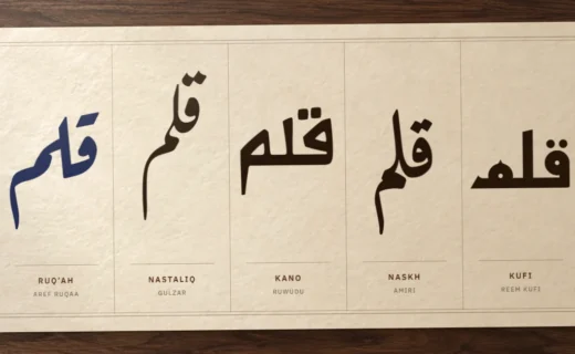
Kufi, Naskh, Thuluth, Diwani, Ruq'ah, Nastaliq, Maghribi and the rarer pens: how to tell them apart by angle, alif and baseline, where each one… Read more : Arabic Calligraphy Styles Compared: A Visual Key to Nine Scripts
The Best Free Arabic Fonts in 2026: 12 Picks From 109 Tested
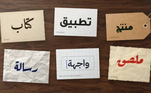
Twelve free Arabic fonts picked from 109 tested families: Amiri, Scheherazade New, IBM Plex Sans Arabic, Tajawal, Reem Kufi, Lalezar, Aref Ruqaa and more,… Read more : The Best Free Arabic Fonts in 2026: 12 Picks From 109 Tested
How to Choose an Arabic Font: A Five-Step Method
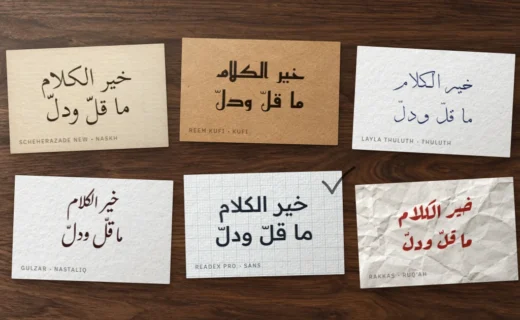
Define the job, pick one of ten Arabic styles, list your constraints, test harakat and joining with your own words, then check the license.… Read more : How to Choose an Arabic Font: A Five-Step Method