The Best Free Arabic Fonts in 2026: 12 Picks From 109 Tested
The best Arabic fonts you can use for free in 2026 are Amiri for books, IBM Plex Sans Arabic and Tajawal for interfaces, Reem Kufi for identities and Lalezar for posters, with seven more picks below. We chose them from the 109 free families in our catalog after setting the same vocalized lines in every one and opening each original file. All of them can be used commercially and self-hosted.
How we tested 109 families
A long list of names does not help you ship. This selection is short on purpose, and every measurement in it comes from a test you can repeat.
- Same files you download. On October 26, 2026, we read the original regular file inside each ZIP of our catalog with fontTools: version string, glyph count, mark-positioning tables, Arabic-Indic digits (٤٥٦) and Persian digits (۴۵۶), Latin letters and the embedding flag.
- Same two lines. We set the same fully vocalized line in every family: the opening of a classical verse famous for gathering all 28 letters, صِفْ خَلْقَ خَوْدٍ كَمِثْلِ الشَّمْسِ إِذْ بَزَغَتْ يَحْظَى الضَّجِيعُ بِهَا. Our test stops at بِهَا, so it does not use every letter. Each family then got a second line of hard cases, notably a shadda (شدّة, shadda), the doubling mark, carrying a vowel on a final lam and inside a word: قَلَّ وَدَلَّ، كُلُّ، مُحَمَّدٌ.
- Same browser. Chrome 156 on Windows 11, with our web previews at weight 400. The defects reported below for Changa, Lemonada and Fandogh were reproduced with the original TTF files.
- Presence is not placement. fontTools tells us whether a font contains mark-positioning tables. Only the rendering shows whether the marks land in the right place, so we report the two separately.
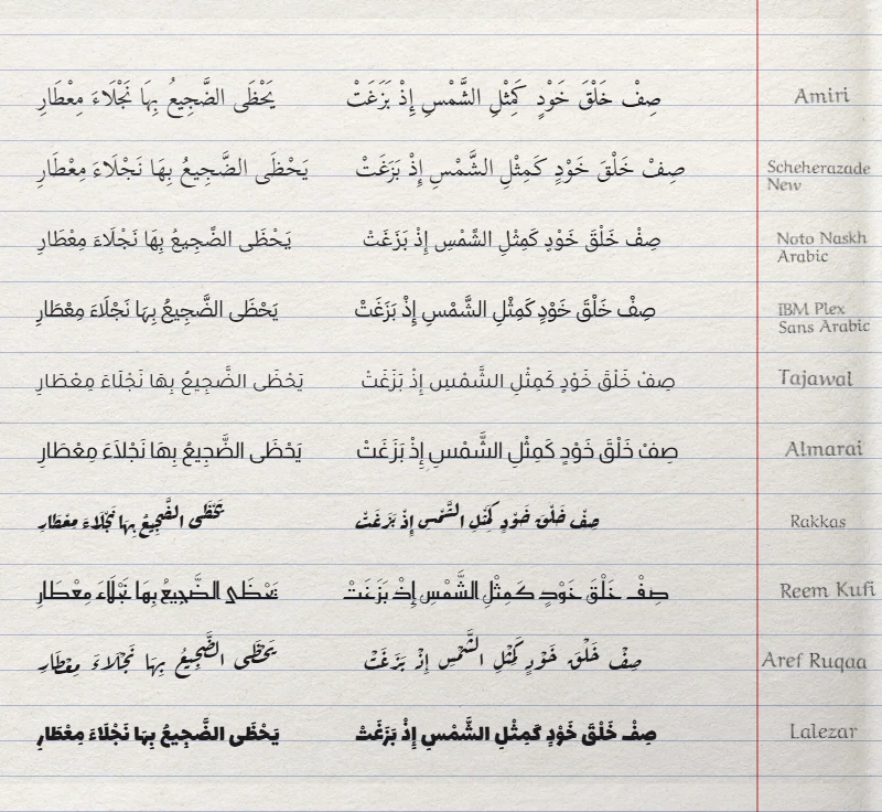
Web sizes quoted here are those of our self-hosted previews, which keep Arabic and basic Latin. The ZIP always holds the complete original files and their license.
Best for long text (Naskh)
Naskh, النسخ (an-naskh), is the style of books, newspapers and schoolbooks. Arabic readers expect it for anything longer than a page, so a text face has to carry vowel marks at small sizes without collisions.
1. Amiri: the editorial benchmark
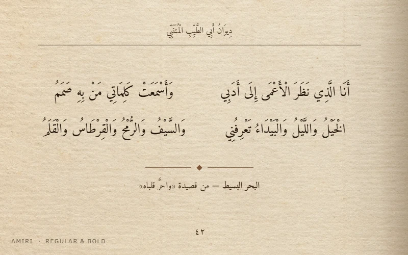
Amiri, by Khaled Hosny and Sebastian Kosch, revives the Naskh type of the Bulaq Press in Cairo, also known as the Amiria Press. Version 1.002 of its Regular file holds 6,710 glyphs, more than any other text face in this list. Most of them are ligatures and contextual variants, which is why a page in Amiri looks typeset rather than simply displayed. It comes in Regular and Bold, with Latin letters.
Bench: mark-positioning tables present, marks correct on both our lines, both digit sets present. Use it for books, theses, poetry and any vocalized text. Skip it for app interfaces. Plan for about 120 KB per weight on the web.
2. Scheherazade New: built for full vocalization
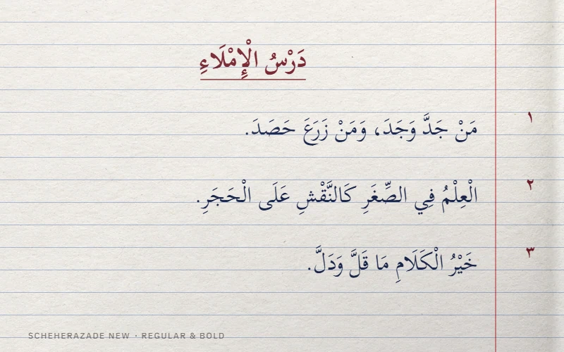
Scheherazade New comes from SIL International, which designs fonts notably for Arabic-script publishing. It is drawn for fully vocalized text, with generous room for marks. Our file covers Arabic and Latin; if your text uses letters from other languages, check every one you need. Version 4.500 has four upright weights, from Regular 400 to Bold 700.
Bench: 1,822 glyphs, marks correct on both lines, both digit sets present. Use it for textbooks, learning material, religious and literary editions. Watch the web budget: 97 KB for Regular, up to 123 KB depending on the weight.
3. Noto Naskh Arabic: the multilingual workhorse
Noto Naskh Arabic belongs to Google’s Noto collection, designed so that many writing systems share one visual family. Version 2.021 is a single variable file from 400 to 700, covering Arabic, Persian and Latin. It is more even and less calligraphic than Amiri, which suits reports and multilingual publications. It does not include Noto Naskh Arabic UI, which Google Fonts describes separately for application and website interfaces.
Bench: 1,719 glyphs, marks correct on both lines. About 52 to 56 KB per weight.
Also worth testing: Markazi Text, a moderate-contrast Naskh from a University of Reading and Google project, with Arabic by Borna Izadpanah under Fiona Ross’s design direction and Latin by Florian Runge. Variable from 400 to 700, it weighs 32 to 34 KB per weight: the lightest text face in this selection. One condition: tag the text as Arabic (lang="ar"). Without that tag, or under lang="fa", a shadda carrying a vowel detached in our test with the original file.
Best for interfaces and products (sans)
Modern Arabic sans fonts simplify the pen stroke: low contrast, open counters, even color on screen. They are the Arabic counterpart of the neutral sans faces used in most apps.
4. IBM Plex Sans Arabic: the bilingual system
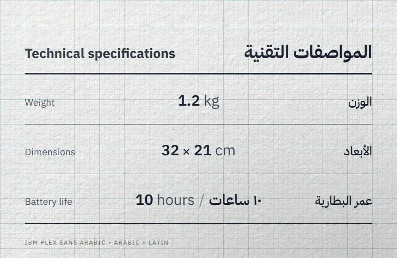
IBM Plex Sans Arabic extends IBM’s Plex system to Arabic in seven upright weights, Thin 100 to Bold 700. Google Fonts credits Mike Abbink, Bold Monday, Khajag Apelian and Wael Morcos. If a product already runs on Plex, this is the shortest path to a coherent Arabic version, and Medium plus SemiBold give fine control over interface hierarchy.
Bench: version 1.101, 1,706 glyphs, marks correct on both lines, both digit sets present. 38 to 42 KB per weight.
5. Tajawal: the smallest web files
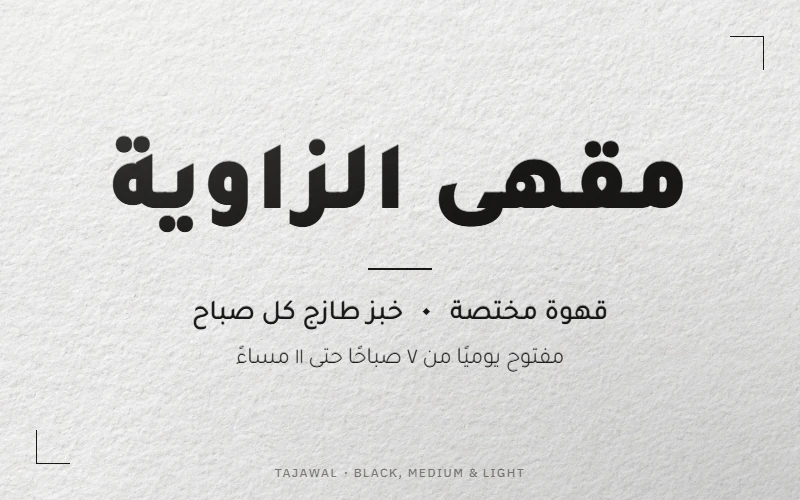
Tajawal, from Boutros Fonts (Mourad Boutros and Soulaf Khalifeh), offers seven weights from ExtraLight 200 to Black 900 and a Latin drawn to match. Its compact design, 465 glyphs in version 1.700, keeps each web file at 14 to 15 KB: four weights of Tajawal weigh less than one weight of Amiri.
Bench: marks correct on both lines, Arabic-Indic digits present, no Persian digits, so test it before a Persian or Urdu interface. Use it for websites, dashboards, signage and brand systems.
6. Noto Sans Arabic: weight and width
Noto Sans Arabic is neutral, thorough and variable on two axes: weight from 100 to 900 and width from 62.5 to 100. A narrower width is rare among free Arabic fonts and useful for long labels in tight components. Our previews show nine weights at full width; the downloaded file keeps both axes for compatible software.
Bench: version 2.012, 1,711 glyphs, marks correct on both lines. 47 to 52 KB per weight.
7. Readex Pro: built around reading ease
Readex Pro extends the reading-focused approach of the Lexend project to Arabic, with credits including Thomas Jockin and Nadine Chahine. It is variable in weight from 160 to 700 and adds an expansion axis that widens letters. Treat that axis as something to test with your readers, not as a guarantee for dyslexia.
Bench: version 1.205, 1,061 glyphs, marks correct on both lines, Arabic-Indic digits present, Persian digits absent. 18 to 19 KB per weight, close to Tajawal.
Also worth testing: Almarai, also from Boutros Fonts, in Light, Regular, Bold and ExtraBold. Open shapes and low contrast make it comfortable for short paragraphs, reports and packaging, at 22 to 24 KB per weight.
Best Kufi for logos and identities
Kufi, الكوفي (al-kufi), is the angular, geometric family of early Qur’anic manuscripts and inscriptions. In free fonts it ranges from historical revivals to signage systems.
8. Reem Kufi: historical geometry for titles
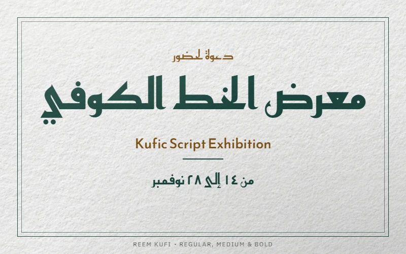
Reem Kufi draws on early Mushafi Kufi and the Fatimid grid, following the work of the calligrapher Mohammed Abdul Qadir. Khaled Hosny drew the Arabic and Santiago Orozco the Latin. Version 2.000 is variable from 400 to 700, at 15 to 16 KB per weight. Use it for a short name, an exhibition or a cultural brand, and give long explanations to a quieter sans.
Bench: 815 glyphs, marks correct on both our lines.
Also worth testing: Kufam, drawn for bilingual signage by Wael Morcos (Arabic) and Artur Schmal (Latin). Six weights from 400 to 900, each with a real italic, which is unusual for an Arabic family.
Best for headlines and posters
Display faces are built for a few words seen from a distance. Judge them on your real title, at the size it will be printed or shown.
9. Lalezar: poster energy
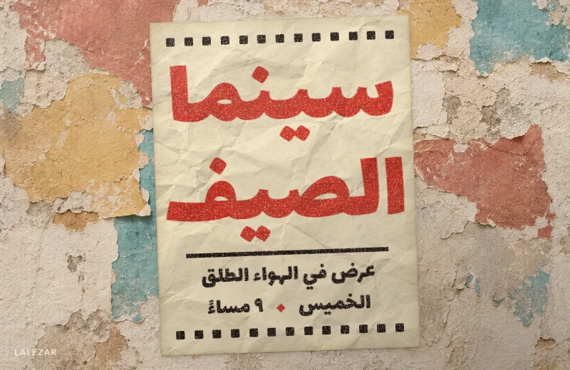
Lalezar, by Borna Izadpanah, takes its cue from popular Iranian “Film-Farsi” posters of the 1960s and 1970s. One heavy weight, built for event names, covers and video thumbnails. Pair it with a calm sans for dates and details.
Bench: version 1.004, 1,221 glyphs, marks correct on both our lines. Check them at small sizes: its dense shapes leave them little room. About 34 KB.
10. Rakkas: Ruq’ah from the cinema
Rakkas, by Zeynep Akay, draws on the Ruq’ah lettering of Egyptian movie posters from the 1950s and 1960s. Contextual alternates let the words flow like painted lettering, and its Latin answers with an informal blackletter. Try several real titles, because the alternates change the composition, and leave room above and below the line.
Bench: version 2.000, 926 glyphs, marks correct on both lines. About 28 KB.
Best for a handwritten touch (Ruq’ah)
Ruq’ah, الرقعة (ar-ruqʿa), is the quick everyday hand taught in schools across much of the Arab world. A Ruq’ah font brings that personal tone to short texts.
11. Aref Ruqaa: everyday handwriting
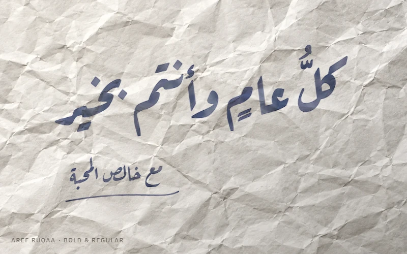
Aref Ruqaa, drawn by Abdullah Aref and developed with Khaled Hosny, keeps the pace of the hand: short letters and tight joins. Its Latin is based on Hermann Zapf’s AMS Euler, so even the English line looks hand-drawn. Regular weighs 48 KB on the web and Bold 55 KB. Use it for invitations, greetings, shop signs and craft brands, never for paragraphs.
Bench: version 1.003, 739 glyphs, marks correct on both lines, both digit sets present.
Thuluth, Diwani and Nastaliq: free options and limits
Thuluth, الثلث (ath-thuluth), and Diwani, الديواني (ad-diwani), are the styles of monumental calligraphy and Ottoman decrees. Free fonts in these styles remain rare. Three families in our catalog claim them, each with limits you should know before a cover or a logo.
- Layla Thuluth and Layla Diwani, by Mohammed Isam (version 2.0, one weight each), reuse these letterforms, set on a single baseline. Their files have no mark-positioning table: marks sit at fixed heights, so check every vocalized word. The OS/2 table of Layla Diwani also carries the “Restricted License embedding” flag (fsType 2). Its OFL license allows embedding, but software that honors the flag refuses to embed the font in a PDF or a Word file, or replaces it. Convert the title to outlines or an image, and run a test export.
- Tholoth, from the Arabeyes project (package 2.0), has longer strokes and a mark-positioning table. The version field inside its file still carries a date from 1995, its embedding flag allows preview and print only, and it ships under the GPL with the font exception.
None of them composes words in stacked layers the way a calligrapher does. For a logo in these styles, a calligrapher is still the better route; for a title, these fonts are a fair start.
12. Gulzar: Nastaliq that works in a browser
Nastaliq, النستعليق (nastaʿliq), slopes each word down to the left and is the reading style of Urdu. Gulzar is a Nastaliq for Urdu books with its own Latin companion, designed by Borna Izadpanah with Fiona Ross (consulting), Alice Savoie (Latin) and Simon Cozens (engineering).
Bench: version 1.000, 1,161 glyphs, correct rendering on both lines in Chrome. Plan generous line spacing and about 175 KB on the web.
By contrast, Awami Nastaliq from SIL relies on the Graphite shaping engine: in Chrome its letters did not join. Use it in LibreOffice or Firefox (enable Graphite if needed), and avoid it on a web page that must also work in Chrome, Edge or Safari.
Tested, not recommended for now
Some popular families failed our tests. They may still suit text without vowel marks, but you should know before choosing them.
- Changa (version 3.003) and Lemonada (version 4.005): a shadda carrying a vowel detaches from its letter and floats to one side. Unvocalized headings are not affected.
- Fandogh (version 1.00): letters stay in their isolated forms in Chrome, so Arabic words fall apart.
These results describe one browser on one system. If your project runs elsewhere, repeat the test there before you decide.
Comparison: weights, web size, license
| Font | Style | Weights | Latin | Web file, weight 400 | License | Best for |
|---|---|---|---|---|---|---|
| Amiri | Naskh | 2 | Yes | ~120 KB | OFL 1.1 | Books, poetry, vocalized text |
| Scheherazade New | Naskh | 4 | Yes | ~97 KB | OFL 1.1 | Textbooks, full vocalization |
| Noto Naskh Arabic | Naskh | 4 (variable 400–700) | Yes | ~52 KB | OFL 1.1 | Reports, multilingual print |
| Markazi Text | Naskh | 4 (variable 400–700) | Yes | ~32 KB | OFL 1.1 | Articles, editorial web |
| IBM Plex Sans Arabic | Sans | 7 | Yes, Plex | ~38 KB | OFL 1.1 | Product UI, documentation |
| Tajawal | Sans | 7 | Yes, matched | ~14 KB | OFL 1.1 | Websites, brand systems |
| Noto Sans Arabic | Sans | 9 (variable 100–900, width axis) | Yes | ~47 KB | OFL 1.1 | Dense interfaces |
| Readex Pro | Sans | 7 (variable 160–700) | Yes | ~18 KB | OFL 1.1 | Reading apps, education |
| Almarai | Sans | 4 | Yes | ~23 KB | OFL 1.1 | Reports, packaging |
| Reem Kufi | Kufi | 4 (variable 400–700) | Yes | ~15 KB | OFL 1.1 | Logos, cultural titles |
| Kufam | Kufi | 6 (variable 400–900, italics) | Yes | ~38 KB | OFL 1.1 | Bilingual signage |
| Lalezar | Display | 1 | Yes | ~34 KB | OFL 1.1 | Posters, covers |
| Rakkas | Ruq’ah display | 1 | Yes, informal blackletter | ~28 KB | OFL 1.1 | Film titles, retro headlines |
| Aref Ruqaa | Ruq’ah | 2 | Yes, based on AMS Euler | ~48 KB | OFL 1.1 | Invitations, signs |
| Gulzar | Nastaliq | 1 | Yes | ~175 KB | OFL 1.1 | Urdu books and titles |
“Weights” counts the styles in our previews; a variable file also allows the values in between. Each ZIP contains the original files and the license text.
“Free” fonts that are not free to use
Search results for Arabic fonts are full of download portals. Two traps come up again and again.
- Personal-use licenses. Free for a mock-up, forbidden for a logo, a product or a client website.
- Repackaged commercial fonts. Retail Arabic families circulate renamed or “shared” on download sites. The brand that ships them carries the risk, whatever the site claims.
Our catalog only hosts three kinds of license: the SIL Open Font License 1.1 (92 of 109 families), Apache 2.0 (the two Droid families) and the GPL with the font exception (15 older families from Arabeyes, GNU FreeFont and PakType). All three allow commercial use. The font exception means that embedding the font in a document does not place that document under the GPL. The OFL forbids selling the font file on its own.
Next steps: test, choose, install
Our bench covers one browser on one system. Copy our two test lines into the software where your project will live, and keep the font version you approve with the project files. To decide between two finalists, follow our guide on how to choose an Arabic font for a project. Then install Arabic fonts on Windows, macOS or Linux, and type your real copy, vowel marks included, in our online Arabic keyboard before you commit to a layout.